Happenly Progressive Web Application - Know what's on
Project Overview
Happenly is a Progressive Web App (PWA) for discovering, filtering, and visualizing events. It’s designed as a smart event companion: users can filter by city, control how many events are shown, expand details when needed, and explore charts that summarize what’s on.
- Role: Solo front-end developer
- Context: Course project focused on modern React, testing, and PWA concepts
- Tech: React, Vite, SCSS, Recharts, Node.js, AWS Lambda, Google Calendar API, Workbox, Jest, Puppeteer, Cucumber
The brief was to build a responsive, accessible event app that consumes a real events API, supports offline usage, and behaves like a native app when installed. I treated it as a chance to practice test-driven thinking (via BDD), PWA architecture, and data visualization in a real-world front-end project.
Read more about the brief and goalsCollapse brief and goals
The Challenge
The assignment defined Happenly as an events dashboard on top of Google Calendar data. The app needed to:
- Fetch upcoming events from a Google Calendar feed,
- Let users filter events by city,
- Control how many events are displayed,
- Expand and collapse event details,
- Provide basic charts that visualize key aspects of the events,
- And continue to be useful offline as a Progressive Web App.
Behind that, there was a second challenge: design the app in a way that’s testable. The feature set was expressed in Gherkin feature files, so the UI and logic had to be structured to support Cucumber scenarios, Jest unit tests, and Puppeteer end-to-end tests.
Objectives and Success Criteria
Within this brief, I set a few concrete goals:
-
Make filtering feel intuitive
Typing into the city field should surface suggestions quickly, and users should understand immediately when there are no events for a location. -
Keep the event list under control
Let users specify how many events to show, so they can switch between a broad overview and a narrow focus. -
Balance overview and detail
Show a compact list by default, with expandable panels for details and a dedicated charts view for bigger-picture insight. -
Behave like a PWA
Cache essential assets and data so previously loaded events remain available offline, and support “Add to Home Screen” for a native-like feel. -
Back everything with tests
Use BDD-style scenarios to define behavior, Jest for unit tests, and Puppeteer for end-to-end flows, so the app feels reliable from both a user and developer perspective.
I considered the project successful if:
- Users could discover and filter events without confusion,
- The app remained usable when offline (at least for cached data),
- The charts added value instead of feeling decorative,
- And the test suite gave confidence when refactoring or adding behavior.
Architecture Overview
Happenly is a React single-page application built with Vite and SCSS, backed by a small Node.js AWS Lambda function that talks to the Google Calendar API, and wrapped in a PWA shell powered by Workbox.
Read architecture detailsCollapse architecture details
-
Front-end structure (React + Vite)
The UI is split into focused components:- city search and suggestions,
- number-of-events control,
- event list and expandable event cards,
- and a charts view that uses Recharts.
Vite handles fast local development and optimized builds.
-
Events data & backend integration
A custom Node.js function deployed as an AWS Lambda serves as a lightweight backend. It:- authenticates with the Google Calendar API,
- fetches upcoming events,
- normalizes them into a front-end-friendly format,
and exposes them via a simple HTTP endpoint.
-
PWA shell & offline behavior
A custom service worker configured with Workbox:- precaches the core shell and key assets,
- caches event responses for reuse when offline,
- and handles fallbacks when the network is unavailable.
-
Charts and analytics
The charts view uses Recharts to plot:- the number of events over time,
- and distribution across locations or other dimensions derived from the data.
This gives users a compact visual overview, not just a long list.
-
Testing infrastructure
- Jest for unit tests around pure logic and smaller components,
- Puppeteer for end-to-end tests that drive a headless browser through key user flows,
- Cucumber + Gherkin feature files to describe behavior in human-readable scenarios and align tests with user stories.
What the app does
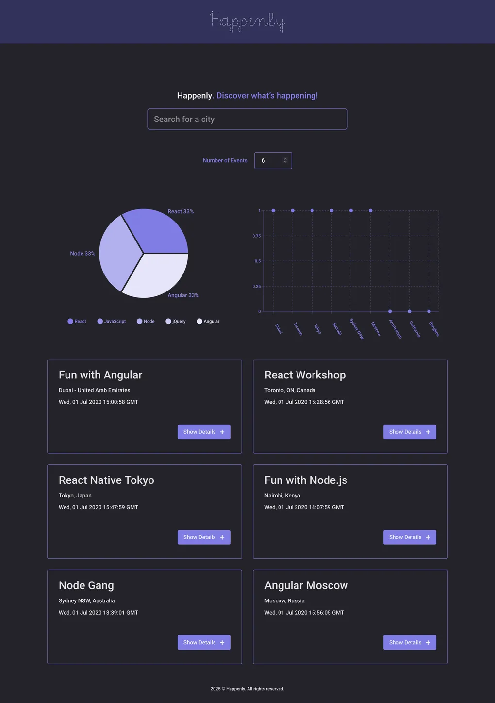
From a user’s point of view, Happenly lets you:
- Filter events by city using a search box with real-time suggestions.
- Control how many events are shown via a “number of events” input.
- Expand and collapse event details to see more information only when you need it.
- Use the app offline for events you’ve already loaded, thanks to service worker caching.
- Install it as a PWA on desktop or mobile for one-tap access from the home screen.
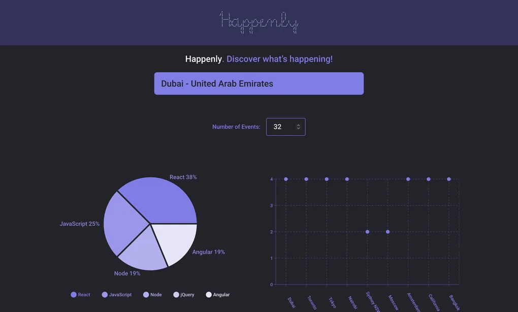
- View charts that summarize the event landscape, making it easier to spot patterns (for example, how busy a city is over time).
The goal is to feel like a compact events dashboard you can open quickly, adjust to your needs, and trust—even when your connection isn’t perfect.
Home screen
Implementation & Testing
Key implementation highlights
- City filtering & suggestions: Implemented a city search box with suggestion lists, so typing “Ber” can surface “Berlin, Germany” and similar matches.
- Event list controls: Added a “number of events” control with validation to keep the list readable and avoid overwhelming users.
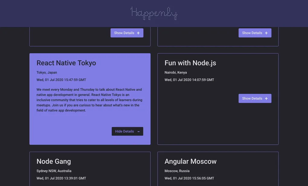
- Expandable event cards: Built expandable/collapsible panels so users can choose when to see full event details.
- Charts view: Used Recharts to visualize event data, turning raw lists into a more digestible overview.
- PWA & offline caching: Configured a service worker with Workbox to cache key assets and previously loaded events for offline use.
- Backend integration: Integrated a Node.js AWS Lambda that fetches events from the Google Calendar API and exposes them to the front end.
Read full implementation processCollapse full implementation process
Phase 1 – Defining user stories and BDD scenarios
I started not with components, but with Gherkin feature files. For each core feature (filtering by city, showing/hiding details, specifying number of events, offline behavior, PWA installation, charts), I wrote scenarios in the form:
Given … When … Then …
This clarified:
- the default states (e.g. showing events from all cities when no filter is applied),
- expected responses to edge cases (no events in a city, invalid number of events),
- and what users should see when offline.
Key learning: Writing behavior in plain language first makes it easier to design both UI and tests in a consistent way.
Phase 2 – Building the main event list
With the behavior defined, I built the core event list:
- A controlled city input with suggestion dropdown,
- A number-of-events input with validation and helpful messages,
- A list of events, limited to the current “number of events” setting.
This was backed by a data-fetch layer that calls the AWS Lambda endpoint and normalizes the response into the format the UI expects.
Key learning: Keeping data fetching and UI concerns separated made it easier to test and iterate on either side.
Phase 3 – Expandable event details
Next, I implemented expandable/collapsible event cards:
- By default, cards show only high-level info,
- A “Show details” button reveals the full description and extra metadata,
- The same button toggles to “Hide details” to collapse the panel again.
This pattern maps directly to BDD scenarios about default collapsed state and user interaction, and it improves scan-ability when many events are visible at once.
Key learning: Simple expand/collapse behavior can significantly reduce information overload when working with long lists.
Phase 4 – Charts and analytics
Once the list felt solid, I added the charts view using Recharts:
- One chart shows how many events occur on upcoming dates,
- Another can show distribution of events across cities or other dimensions derived from the Google Calendar data (depending on what’s available).
The charts respond to the same data source as the list, so they stay in sync with what the user is seeing.
Key learning: Visualizations don’t have to be complex to be useful; even simple count/distribution charts add value over a plain list.
Phase 5 – PWA features and offline behavior
I then focused on the PWA aspects:
- Added a manifest and icons for installability,
- Used Workbox to generate a service worker that:
- precaches essential assets and shell UI,
- caches responses for events data,
- falls back gracefully when the network is unavailable.
This allowed scenarios like:
- seeing a friendly message when opening the app offline for the first time,
- revisiting previously loaded events while offline without errors.
Key learning: Thinking through first-time vs. returning offline usage is important to avoid confusing states.
Phase 6 – Testing with Jest, Puppeteer and Cucumber
Finally, I wired the test stack:
- Jest for unit tests of pure logic (e.g. filtering, limiting, validation),
- Cucumber to link Gherkin scenarios to step definitions,
- Puppeteer to drive a real browser against the built app:
- typing into the city filter,
- expanding event details,
- changing the number of events,
- verifying messages in offline-like conditions.
Key learning: Having tests that reflect the original BDD scenarios gives a strong sense of alignment between requirements and implementation.
Testing strategy
Happenly uses a multi-layer testing strategy: unit tests for logic, BDD-style feature tests, and end-to-end tests in a headless browser, complemented by manual exploratory testing.
Read more about testingCollapse testing details
-
Unit tests (Jest)
- Validate core logic such as:
- filtering events by city,
- limiting the number of visible events,
- handling invalid input values.
- Run quickly and provide fast feedback during development.
- Validate core logic such as:
-
BDD scenarios (Cucumber)
- Gherkin feature files describe behavior like:
- default event list when no city is selected,
- what happens when a city has no events,
- showing and hiding event details,
- offline usage with and without cached data.
- These scenarios act as living documentation and guide the implementation.
- Gherkin feature files describe behavior like:
-
End-to-end tests (Puppeteer)
- Launch a headless browser and simulate real interactions:
- typing into the city filter,
- selecting from suggestions,
- changing the number of events,
- toggling details.
- Confirm that UI, network calls and state updates all work together.
- Launch a headless browser and simulate real interactions:
-
Manual testing
- Exploratory passes in the browser for:
- responsiveness on different viewport sizes,
- basic keyboard navigation and focus handling,
- PWA install prompts and behavior when launching from the home screen.
- Exploratory passes in the browser for:
If I revisit the project, I’d like to extend automated tests around more complex edge cases (for example, stale caches and chart behavior when data is missing or partial).
UX & UI considerationsCollapse UX & UI considerations
UX & UI considerations
Even though this project focused heavily on architecture and testing, my design background influenced several choices:
-
Clear primary task
The main screen focuses on “What’s happening?” in a single place: filters, list and charts are structured so users understand that everything is about upcoming events. -
Search & filters that don’t overwhelm
The city filter and number-of-events control are prominent but not noisy. Labels and helper text explain what they do without cluttering the layout. -
Progressive disclosure
Event cards start compact and only show full details on demand, which keeps the list readable even when many events are visible. -
Accessible interactions
Controls are keyboard-focusable with visible focus states, and interactions like toggling details are designed with accessibility in mind (e.g. appropriate ARIA attributes and announcements where needed). -
Consistent visual language
SCSS is used to build a restrained, consistent visual system—colors, spacing and typography are chosen to support readability and hierarchy rather than decoration.
ResultsCollapse results
Results
From a user’s perspective, Happenly provides:
- A simple way to see what’s on across cities and narrow the view to what’s relevant,
- A controllable event list that doesn’t become overwhelming,
- A balance between quick scanning and deeper detail when needed,
- Offline access to previously loaded events,
- And the convenience of a one-tap PWA on the home screen.
From a learning perspective, this project helped me:
- Combine React, a custom backend and a third-party API into a coherent product,
- Apply BDD and automated testing to a front-end project, not just backend code,
- Implement PWA features (service workers, caching, installation) in a realistic scenario,
- And practice turning raw data into visual insights through charts.
Limitations and Trade-offsCollapse limitations and trade-offs
Limitations and Trade-offs
Some limitations are intentional, given the project’s scope:
-
Single source of events
Events come from a specific Google Calendar; there’s no UI for managing multiple calendars or custom sources. -
Basic filtering model
Filtering centers on city and event count. There’s no advanced filtering by category, price, or tags yet. -
Offline behavior limited to cached data
The app doesn’t fully support complex offline interactions (e.g. creating or editing events offline and syncing later). -
Analytics scope
Charts focus on simple counts and distributions. They don’t yet support advanced filtering or comparison between time ranges. -
No user accounts
There’s no concept of personalized favourites, saved filters or user-specific preferences beyond the current session.
These trade-offs keep the implementation tractable for a course project while still reflecting realistic PWA and testing concerns.
Future Improvements & RoadmapCollapse future improvements
Future Improvements & Roadmap
If I decide to extend Happenly, some natural directions would be:
-
Richer filtering and sorting
Allow filtering by category, price range, tags or date range, and add sort options (soonest first, most popular, etc.). -
User accounts & personalization
Let users create accounts, save favorite events, and store preferred cities or filters. -
More advanced analytics
Add charts that compare different cities, categories or time ranges, and possibly let users export basic data. -
Deeper offline capabilities
Support local creation of “planned events” offline and synchronize them when back online. -
Enhanced accessibility
Run a formal accessibility audit and refine keyboard navigation, announcements and theming based on the findings.
These are not features I am actively building right now, but they form a clear roadmap if I revisit the app to explore more advanced PWA and data visualization topics.
What I learned
Working on Happenly gave me a realistic, end-to-end experience of building a modern front-end application:
- Starting from user stories and Gherkin features instead of jumping straight into components,
- Integrating React with a serverless backend and a third-party API,
- Using Workbox and service workers to add offline and PWA capabilities,
- Visualizing data with charts rather than relying only on lists,
- And supporting the whole thing with a layered testing strategy (Jest, Cucumber, Puppeteer, plus manual testing).
Overall, Happenly helped me connect the dots between UX, data, performance and testing in a single project, and it shows how I approach front-end work when reliability and user experience both matter.
Technologies Used
- React
- Vite (build tool for fast development)
- SCSS (for styling)
- Recharts (for data visualization)
- Node.js
- AWS Lambda (as serverless backend)
- Google Calendar API (events data)
- Service Workers (for offline access)
- Workbox (service worker and caching utilities)
- Jest (unit testing)
- Puppeteer (end-to-end testing)
- Cucumber (BDD testing)
- Babel